How Do You Turn Curiosity Into Conversion?
Branding
Strategy
UI/UX
Conversion Design

FoodCycler turns food scraps into a nutrient-rich byproduct with a countertop appliance. The site needed to introduce an unfamiliar product category, build purchase confidence at a high price point, and move visitors from curiosity to checkout with as little friction as possible.
The Problem
Most visitors arrive without knowing what the product does or why it's worth the price. Every section of the site needed to answer an objection before it was asked.
Educating first, converting second
Since FoodCycler sits in a category most people have never encountered, the homepage was designed to educate and build awareness before asking for a purchase. Every section works toward the same goal: reduce uncertainty and build trust so the path to conversion stays open.
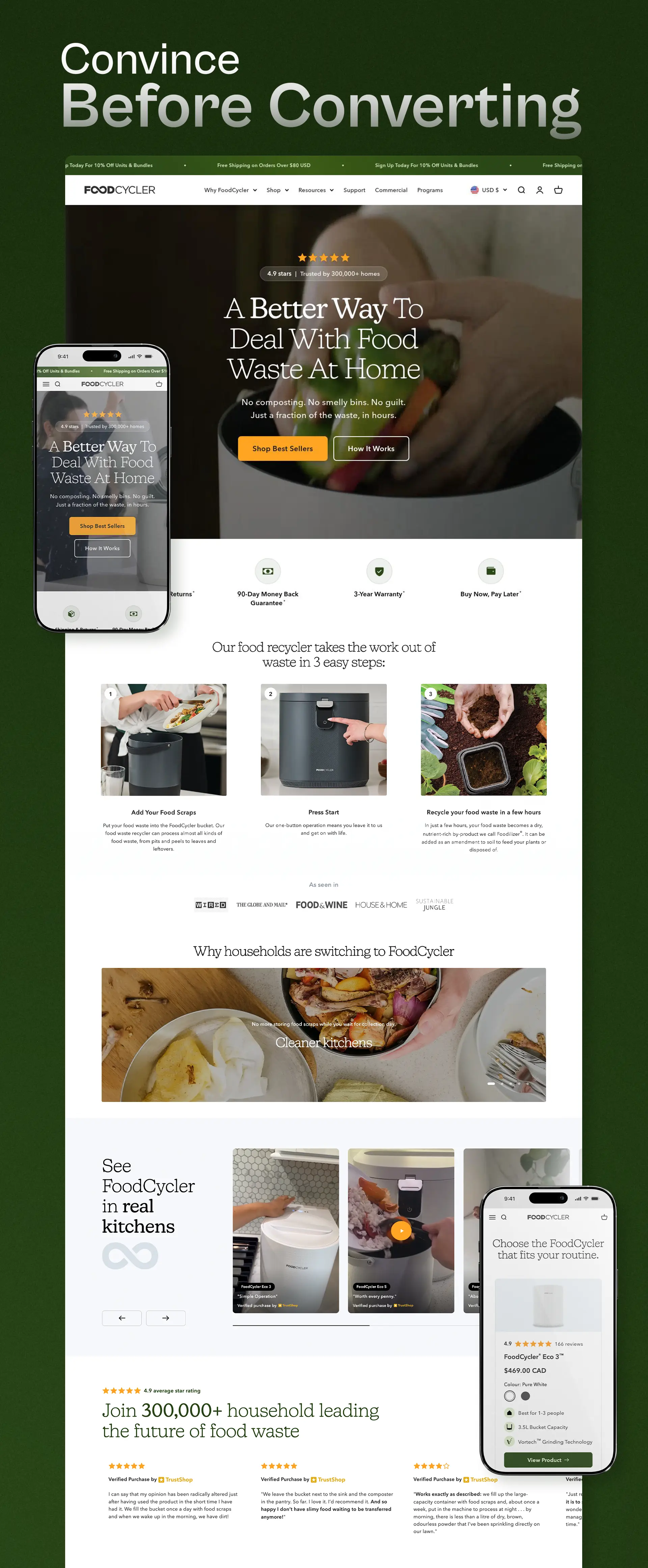
The looped hero video is a custom edit I produced and compressed specifically for this purpose. It gives a visitor a broad, quick understanding of the product without pulling them into a level of scrutiny that could stall their momentum toward converting. It is there to orient, not to explain everything.
From there, sections like "How It Works" and the social proof module (UGC content pulled through a third party review app, linked directly to products and displayed as a reusable component across pages) build trust progressively as the visitor scrolls.
That is generally how I approach ecom and web design: not as decoration, but as problem solving, finding the right structure and sequence to move someone from unfamiliar to confident. All of it stays fully branded throughout, so trust building never comes at the cost of consistency.
Reducing choice friction
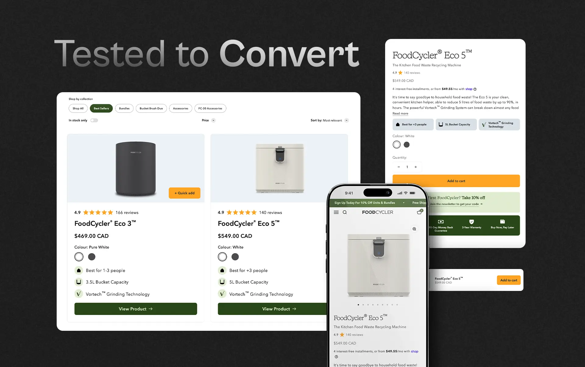
Product cards and product pages show the product capacity, "best for X people" guidance, and quick-add built in, so comparing models never stalls the purchase. This layout went through multiple rounds of A/B testing and design adjustments, tracking how each change affected the events that lead to conversion. Of everything tested, it was the solution that moved the needle the most.
Cart
The cart is one of the most critical elements of any ecommerce site. It is the last checkpoint before someone commits, and the easiest place to lose them if doubt creeps back in.
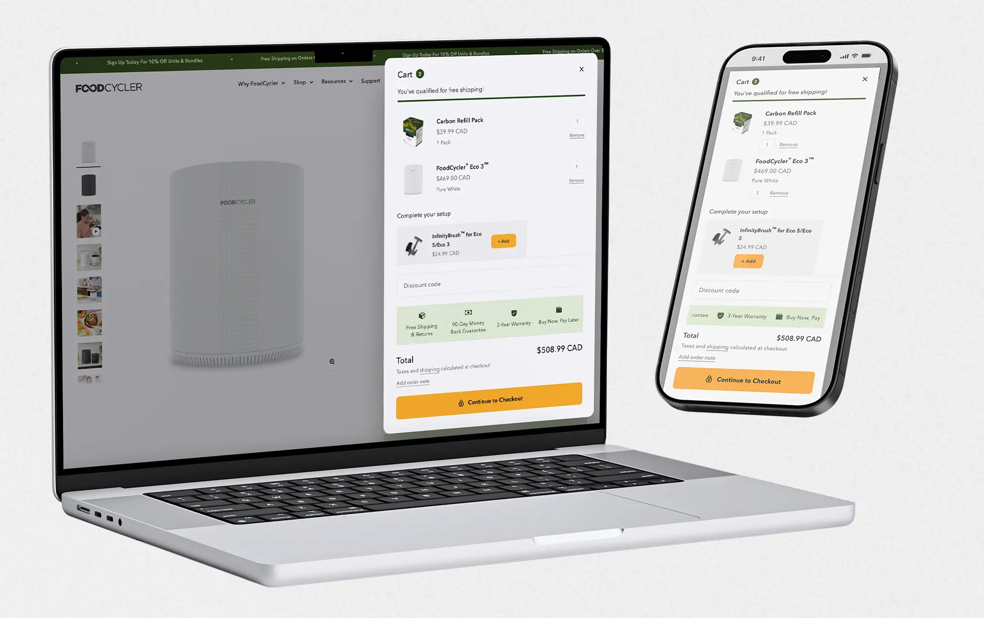
It was designed to surface every element that keeps confidence high: trust icons, progress toward free shipping, upsell suggestions, a clear breakdown of what is being purchased, and a direct path to checkout with no ambiguity about the next step. Small reminders, like the 90 day return policy, are placed deliberately, not as filler, but as quiet reassurance at the exact moment hesitation is most likely to surface.
When designing something like a cart, the goal is never just to lay out functional elements. It is to think through the customer's state of mind at that specific point in the journey, and to make sure nothing in the design gives them a reason to stop and reconsider.
Conclusion
The result was a conversion rate that moved from 0.7% to 1.6%, more than doubling performance, along with a noticeable lift in accessory sales that had previously struggled to convert on their own.
Every design decision throughout the site, from the homepage to the cart, was made with CRO in mind rather than visuals alone. That discipline also had a side benefit: keeping components lean and purposeful, rather than heavy and decorative, helped improve site speed as well, which only reinforced the conversion gains rather than working against them.
Clear UI and a deliberate information hierarchy meant customers could find what they needed, understand why the product and its accessories mattered to them, and move through the journey without friction or hesitation. The numbers reflect what happens when every element on the page is built to answer a question the customer hasn't asked yet, rather than simply to look good.