A Design System for a 900K LinkedIn Follower Feed
Social Media
Branding
Social Media
Illustration

Orange Business runs a LinkedIn presence with more than 900K followers, publishing at a pace few in house teams can sustain without losing consistency. The challenge was never a single post. It was building a system that kept the brand recognizable, the workload manageable, and the quality high, no matter who was producing the next asset.
The Problem
A page at this scale posts constantly, and every post is a brand touchpoint. Without a system, teams either slow down to protect quality or move fast and let consistency slip. On top of that, design requests from other teams kept piling up, turning design into a bottleneck for content that needed to go out quickly. The goal was to solve both problems at once: protect the brand while removing the need to start from a blank canvas every time.
A Grid System Built for Hierarchy
Everything started with a grid. I created a grid system so that every social post follows the same hierarchy, from headline to supporting text to visual to logo placement. Whether someone scrolling the feed is looking at a stat, a quote, or an announcement, their eye lands in the same places and reads the content in the same order.
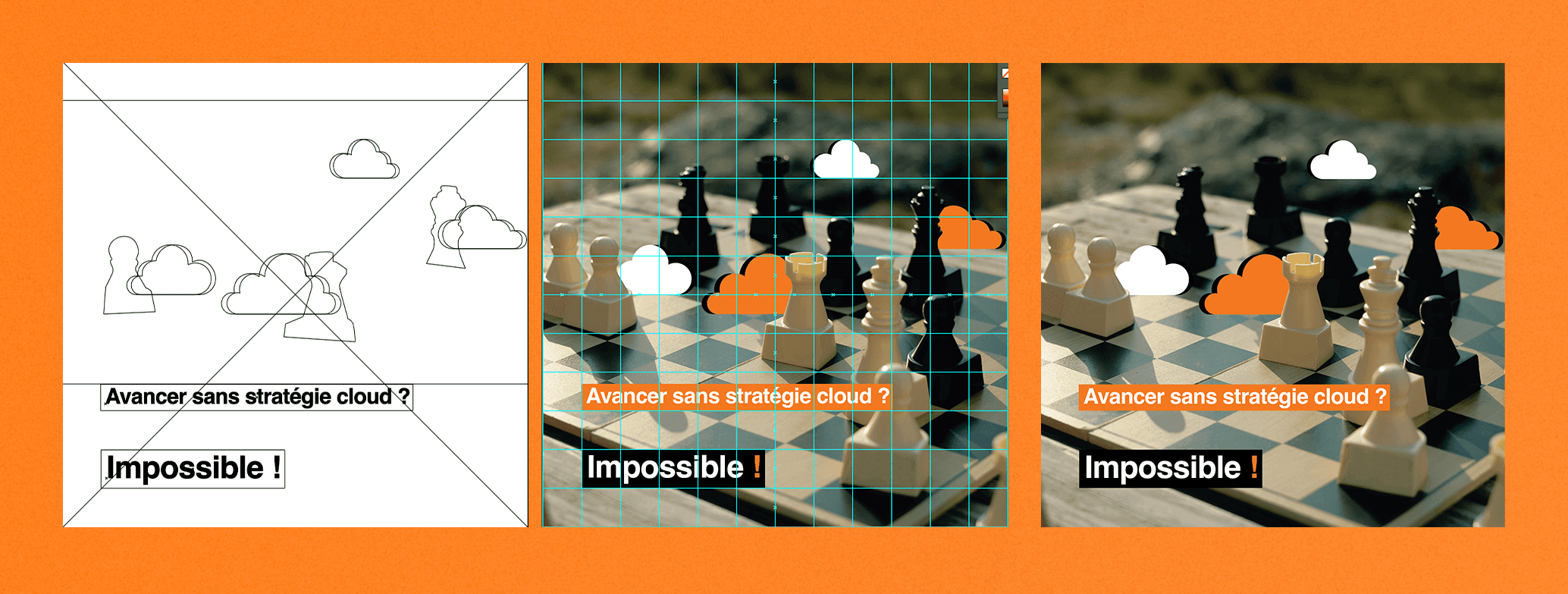
Good composition was treated as part of the system, not as an afterthought. Spacing, alignment, focal points, and breathing room were defined once so they did not have to be reinvented on every post. The grid gave the content a clear structure and gave the feed a rhythm that makes the page feel intentional rather than assembled.
Variety Without Losing the Brand
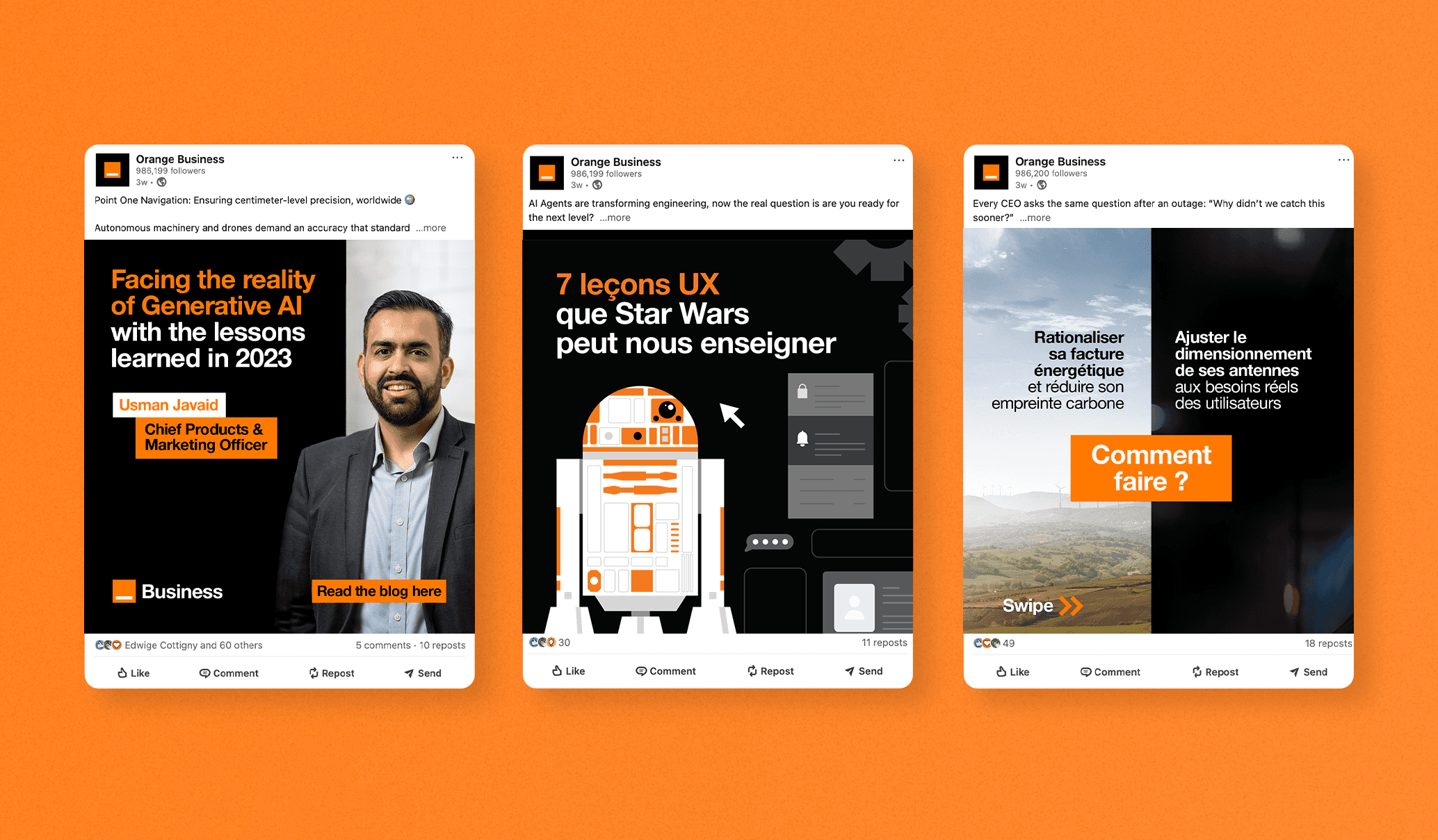
A strict system can easily become a repetitive one, and a repetitive feed gets scrolled past. To avoid that, I worked with the brand's core elements, including color, type, shapes, and illustration, and applied them across different layouts and styles. Some posts are bold and graphic, others are calmer and more editorial, and others lean on illustration.
The result is a feed with real variety that is still instantly recognizable as Orange Business. The brand essence lives in the way the elements are used, not in one fixed layout, which lets the content team choose the style that best fits each message.
Templates That Teams Can Actually Use
Once the visual direction was designed and approved by management through Adobe and Figma, I turned it into a library of ready to use templates covering the formats the page publishes most often: quotes, job postings, press releases, informational content, and more.
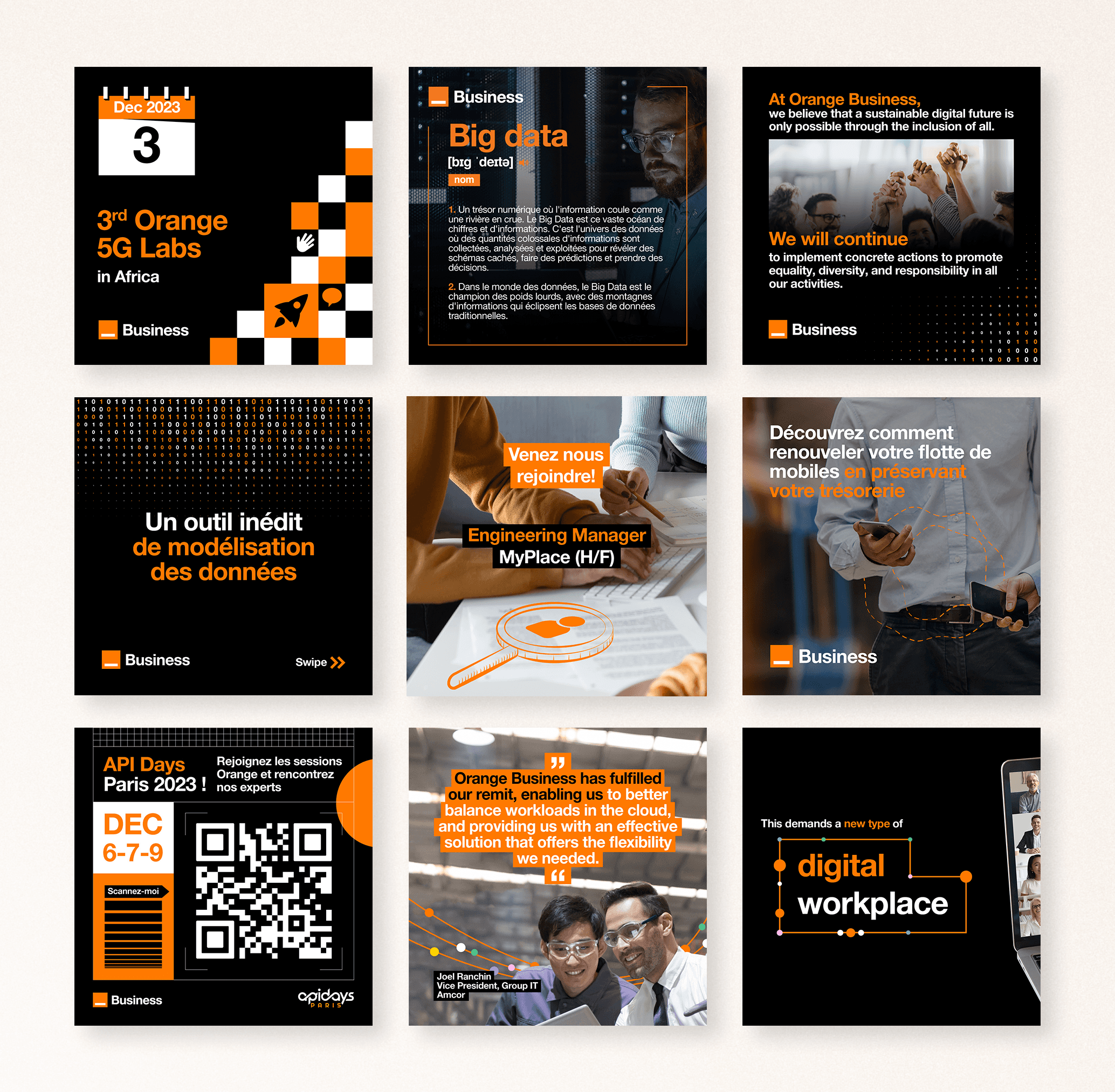
These templates were then made available through tools like Canva, so that team members without design training could produce on brand posts on their own, without waiting on a designer. Approval happened once, at the system level, instead of on every single asset. That shifted design from a request based service to a self serve system, while keeping every output inside the guardrails of the brand.
Conclusion
For a brand at this scale, the most important goal is brand awareness and visibility. Every post is a chance to be recognized in a crowded feed, and a consistent visual language makes that recognition faster and stronger each time someone sees it.
Engagement follows from that, but it also needs to be actively supported. A few things that help keep a page performing and keep the content fresh:
Mixing formats, such as static posts, carousels, and illustrated content, so the feed never feels repetitive
Leading with a clear hook and a strong visual focal point so a post earns attention in the first second
Refreshing layouts and illustration styles within the system, so the brand evolves without losing recognition
Keeping a steady publishing rhythm, which the templates made possible without added pressure on the team
Watching which formats and topics perform best, and feeding that back into new template variations
The impact showed up in a few ways. Design requests from other teams dropped once the templates became available, freeing time for higher value work. Engagement on certain posts increased by up to 300%. Measuring engagement across a long period is difficult, since so many outside factors influence it, but when comparing similar posts to those published before I joined, the newer ones averaged around 35% more engagement in most cases.
The takeaway is that a good design system does more than make things look consistent. It saves time, protects the brand, and gives everyone on the team the tools to keep the page performing.